Next Steps CTA
Closing CTA that shows what happens after the click, a three-step runway with honest mono timing chips ahead of the ask. Trust-first React and Tailwind conversion section.
Preview & code
Installation
pnpm dlx shadcn@latest add @cleverui/cta-next-stepsRequires the @cleverui registry in your components.json, a one-off, two-line setup.
Usage
API reference
CtaNextSteps accepts the following props.
…plus everything from React.HTMLAttributes<HTMLElement>: className, event handlers, aria attributes and the rest pass straight through.
Related components

Beam CTA
Closing CTA where an ink rule draws itself across the page and a single accent pulse travels along it. One line, one accent, one action, reduced motion gets a static rule.
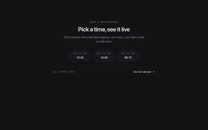
Calendar Slot CTA
Book-a-time CTA offering three preformatted next-available slots as pills with a fallback link, calendar energy through callbacks alone, no scheduling dependency.

Checklist Close CTA
Closing CTA that qualifies before it converts, three 'you're ready if' checklist items tick in sequence before the button gets its turn. Qualification as persuasion.
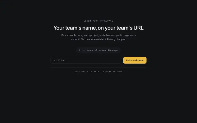
Claim Handle CTA
Namespace-claim CTA, type a handle and the live mono URL preview assembles ahead of one accent claim button. React and Tailwind capture with real form semantics throughout.
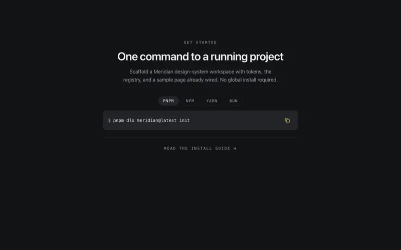
Command Copy CTA
Developer install CTA, package-manager tabs switch one mono command line with a copy-to-clipboard affordance and a quiet docs link. A React and Tailwind closer for dev tools.
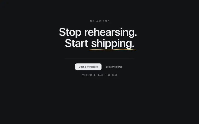
Final Word CTA
End-of-page CTA built around one oversized short statement where a single word earns a drawn primary underline, closed out by dual buttons on a hairline baseline.
Frequently asked questions
How do I install the Next Steps CTA component?
Register the @cleverui registry in your components.json ("@cleverui": "https://cleverops.com.au/r/{name}.json"), then run `npx shadcn@latest add @cleverui/cta-next-steps`. The shadcn CLI copies the source into your project, you own the code from that point. You can also copy the source directly from this page.
What dependencies does Next Steps CTA require?
Next Steps CTA uses motion on top of React and Tailwind CSS. You don't need to install it manually, the shadcn CLI resolves and installs npm dependencies automatically when you add the component.
Can I theme Next Steps CTA to match my brand?
Yes. The component is styled entirely with Tailwind utilities over standard design tokens (primary, background, muted, border), so it inherits your existing shadcn/ui theme automatically. Change your CSS variables and the component follows, no source edits needed for palette, radius, or fonts.
Want this built for you?
CleverUI is built by the Clever Ops web team. If you'd rather ship a hand-coded, fast, custom website than assemble one, we build them for Australian businesses every week.
Explore web development services