Shine Button
Button whose filled variants carry a single sheen sweep on hover, light passing over a surface. Four variants, three sizes, press feedback, full keyboard focus treatment.
Preview & code
Installation
pnpm dlx shadcn@latest add @cleverui/button-shineRequires the @cleverui registry in your components.json, a one-off, two-line setup.
Usage
The example itself also uses lucide-react , install it too if you copy the example as-is (the component itself does not need it).
API reference
ButtonShine accepts the following props.
…plus everything from React.ButtonHTMLAttributes<HTMLButtonElement>, VariantProps<typeof buttonShineVariants>: className, event handlers, aria attributes and the rest pass straight through.
Related components
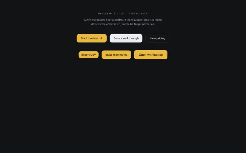
Magnetic Button
Magnetic button done with restraint, at most 8px of pull inside an 80px radius, spring return on leave, and the effect disabled on touch and reduced motion so the hit target stays honest.
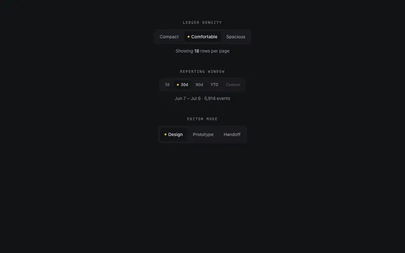
Segmented Button Group
Segmented control drawn like an instrument panel, one hairline frame, a sprung layoutId thumb under the active segment, an indicator lamp, roving tabindex with arrow keys, and cva sizes.
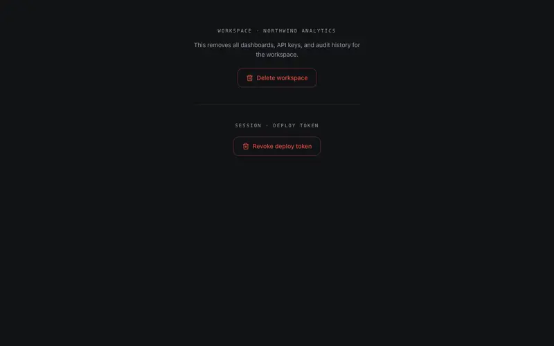
Confirm Hold Button
Press-and-hold confirmation for destructive actions, a radial destructive fill charges while held and fires only past the threshold; releasing early cancels. Holding Space counts exactly the same.
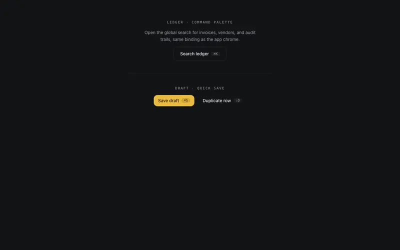
Hotkey Button
A React button that binds a real keyboard shortcut, mac-aware kbd chip, aria-keyshortcuts, a typing-context guard, and a remote-press flash when the hotkey fires it.
Progress Button
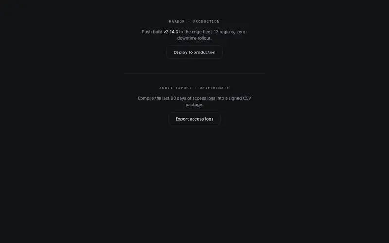
A button that becomes its own progress state, idle, a hairline sweep tracing the border while working, a drawn check on success. Controlled state prop with honest aria-busy announcements.
Split Button
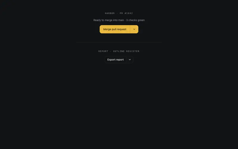
A self-contained split button for React, filled primary action, hairline-divided menu toggle, and real role=menu keyboard semantics with zero Radix or portal dependencies.
Frequently asked questions
How do I install the Shine Button component?
Register the @cleverui registry in your components.json ("@cleverui": "https://cleverops.com.au/r/{name}.json"), then run `npx shadcn@latest add @cleverui/button-shine`. The shadcn CLI copies the source into your project, you own the code from that point. You can also copy the source directly from this page.
What dependencies does Shine Button require?
Shine Button uses class-variance-authority on top of React and Tailwind CSS. You don't need to install it manually, the shadcn CLI resolves and installs npm dependencies automatically when you add the component.
Can I theme Shine Button to match my brand?
Yes. The component is styled entirely with Tailwind utilities over standard design tokens (primary, background, muted, border), so it inherits your existing shadcn/ui theme automatically. Change your CSS variables and the component follows, no source edits needed for palette, radius, or fonts.
Want this built for you?
CleverUI is built by the Clever Ops web team. If you'd rather ship a hand-coded, fast, custom website than assemble one, we build them for Australian businesses every week.
Explore web development services