Quiet Cookie Banner
A consent bar without dark patterns, plain-language copy, a Decline button styled exactly equal to Accept, and a quiet policy links row, docked to the bottom edge.
Preview & code
Installation
pnpm dlx shadcn@latest add @cleverui/banner-cookie-quietRequires the @cleverui registry in your components.json, a one-off, two-line setup.
Usage
API reference
BannerCookieQuiet accepts the following props.
…plus everything from Omit< React.HTMLAttributes<HTMLElement>, 'onDrag' | 'onDragStart' | 'onDragEnd' | 'onAnimationStart' >: className, event handlers, aria attributes and the rest pass straight through.
Related components
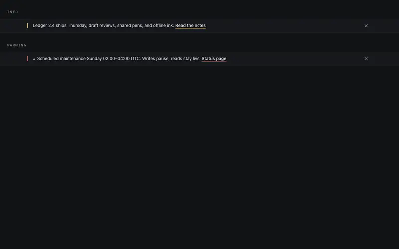
Announce Banner
Top-of-page announcement bar, one line, one link, one dismiss. Height collapses shut on a callback-driven dismiss, with info and warning variants in honest primary and destructive tokens.
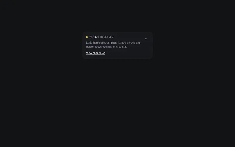
Changelog Toast
A corner toast announcing a release, version in mono, a one-line note, and a view link. Enters after a set delay, dismisses through a callback, appears instantly under reduced motion.
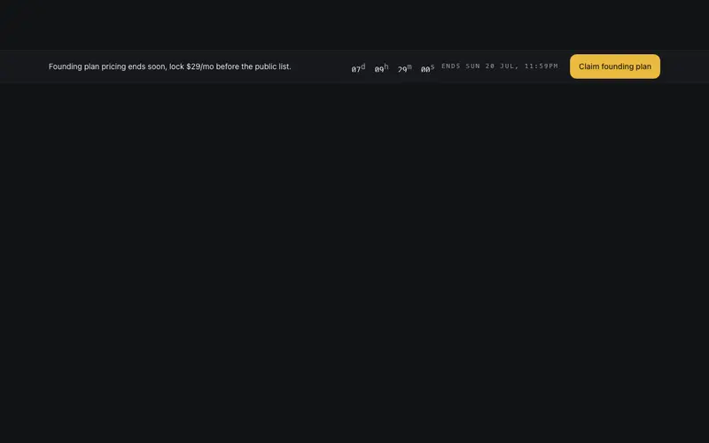
Countdown Rail Banner
Slim offer rail, one line of copy, an inline mini countdown that rolls its digits, a preformatted end label, and a single CTA. Urgency at strip scale, whisper volume.

Preview Mode Banner
Floating preview-mode pill for React sites, hatched draft swatch, mono PREVIEW label, save meta, and a real Exit button. A fixed Tailwind-token capsule; dismissal causes zero layout shift.
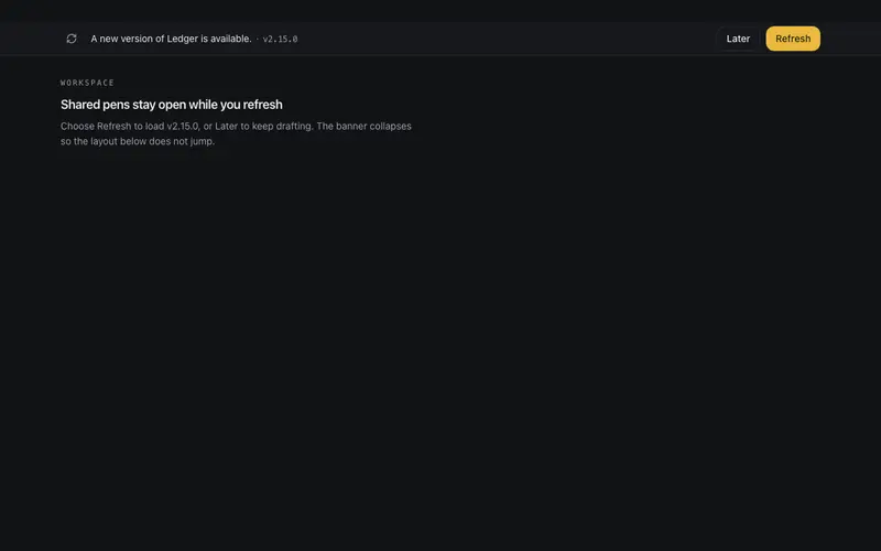
Update Prompt Banner
New-version banner for React apps, one line, a mono version tag, and honest paired Refresh and Later buttons. Height animates shut on dismiss so the Tailwind layout never jumps.
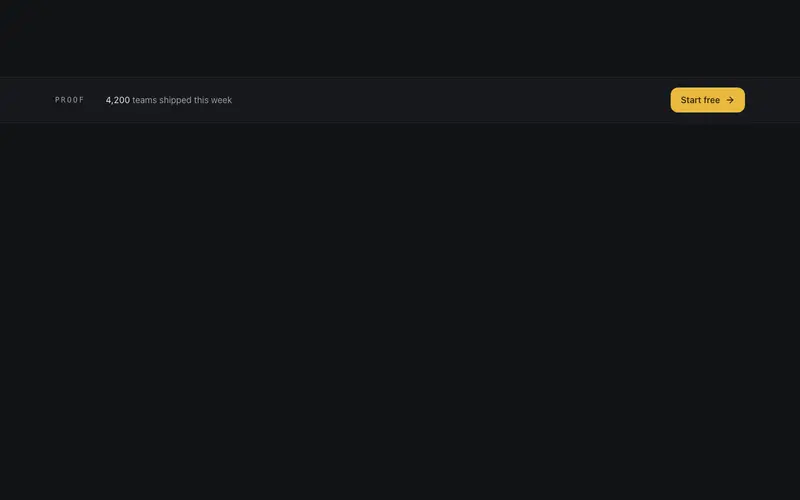
Ticker Bar CTA
Slim full-width conversion bar built to sit mid-page, a single-line rotating proof ticker beside one button, separated by hairlines from surrounding sections.
Frequently asked questions
How do I install the Quiet Cookie Banner component?
Register the @cleverui registry in your components.json ("@cleverui": "https://cleverops.com.au/r/{name}.json"), then run `npx shadcn@latest add @cleverui/banner-cookie-quiet`. The shadcn CLI copies the source into your project, you own the code from that point. You can also copy the source directly from this page.
What dependencies does Quiet Cookie Banner require?
Quiet Cookie Banner uses motion on top of React and Tailwind CSS. You don't need to install it manually, the shadcn CLI resolves and installs npm dependencies automatically when you add the component.
Can I theme Quiet Cookie Banner to match my brand?
Yes. The component is styled entirely with Tailwind utilities over standard design tokens (primary, background, muted, border), so it inherits your existing shadcn/ui theme automatically. Change your CSS variables and the component follows, no source edits needed for palette, radius, or fonts.
Want this built for you?
CleverUI is built by the Clever Ops web team. If you'd rather ship a hand-coded, fast, custom website than assemble one, we build them for Australian businesses every week.
Explore web development services