Pendulum Field
A mounting rail of hairline pendulums swinging at incommensurate periods, phase waves travel down the row, nearly align, and disperse again. One primary bob keeps the beat. Canvas, zero deps.
Preview & code
Installation
pnpm dlx shadcn@latest add @cleverui/bg-pendulum-fieldRequires the @cleverui registry in your components.json, a one-off, two-line setup.
Usage
API reference
BgPendulumField accepts the following props.
…plus everything from React.HTMLAttributes<HTMLDivElement>: className, event handlers, aria attributes and the rest pass straight through.
Related components

Chladni Sand
Thousands of sand grains snap into Chladni resonance figures as the plate's mode changes, order out of noise. React canvas background themed entirely by Tailwind tokens.
Dendrite Growth
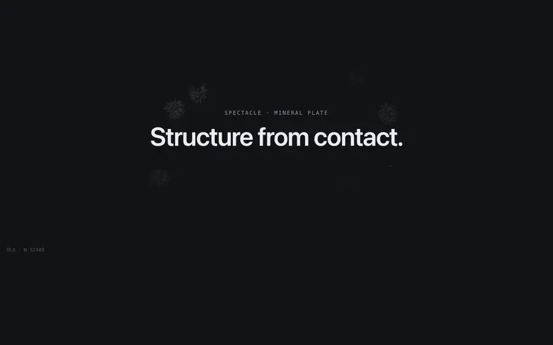
Seeded random walkers freeze into branching mineral dendrites, an accretion frontier tipped in primary with a live particle counter. React canvas background on Tailwind tokens.

Frost Fern
Window frost grows in from the frame, anisotropic ice needles branch at 60 degrees, growth tips glowing primary before curing to ink. Seeded React canvas background on Tailwind tokens.

Galton Board
A Galton board in drafting ink, beads fall through a hairline peg lattice and build a live bell curve, one primary bead tracing its path. React canvas background on Tailwind tokens.

Glyph Tide
A field of mono glyphs breathing like liquid, character weight and ink density follow a flowing noise tide, with a current of accent glyphs threading through. Canvas, zero deps.

Halftone Pulse
A print-press halftone field, dot radii swell as slow waves travel the grid, and the pointer raises its own ripple. Ink-on-paper texture turned kinetic, canvas-drawn.
Frequently asked questions
How do I install the Pendulum Field component?
Register the @cleverui registry in your components.json ("@cleverui": "https://cleverops.com.au/r/{name}.json"), then run `npx shadcn@latest add @cleverui/bg-pendulum-field`. The shadcn CLI copies the source into your project, you own the code from that point. You can also copy the source directly from this page.
What dependencies does Pendulum Field require?
Pendulum Field has no npm dependencies beyond React and Tailwind CSS itself, so there is nothing extra to install or keep updated.
Can I theme Pendulum Field to match my brand?
Yes. The component is styled entirely with Tailwind utilities over standard design tokens (primary, background, muted, border), so it inherits your existing shadcn/ui theme automatically. Change your CSS variables and the component follows, no source edits needed for palette, radius, or fonts.
Want this built for you?
CleverUI is built by the Clever Ops web team. If you'd rather ship a hand-coded, fast, custom website than assemble one, we build them for Australian businesses every week.
Explore web development services