Spec Comparison Table
A two-to-three column vehicle spec table set with drafting precision, mono tabular figures, a per-row winner tick as the single accent, a sticky header row, and real table semantics.
Preview & code
Installation
pnpm dlx shadcn@latest add @cleverui/spec-comparison-tableRequires the @cleverui registry in your components.json, a one-off, two-line setup.
Usage
API reference
SpecComparisonTable accepts the following props.
…plus everything from React.HTMLAttributes<HTMLElement>: className, event handlers, aria attributes and the rest pass straight through.
Referenced types
Related components
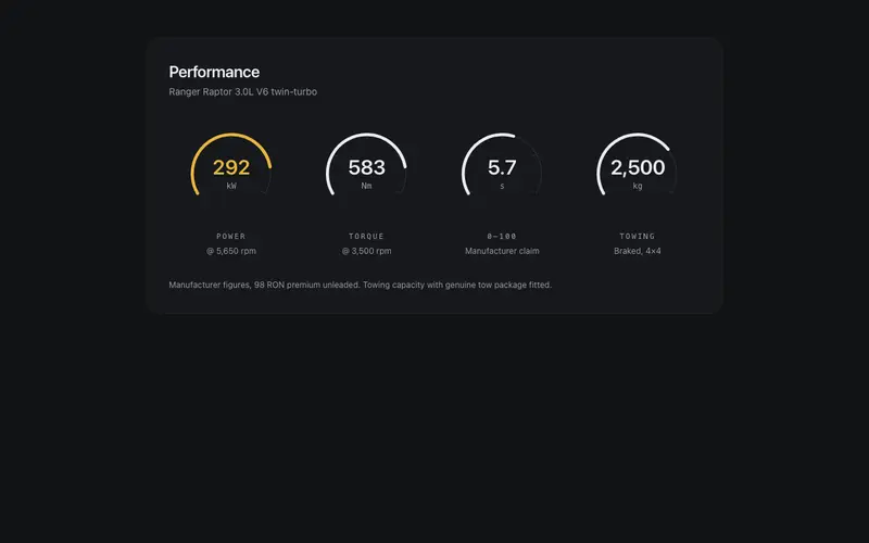
Performance Gauge Cluster
An instrument-cluster stats row for React, 240-degree dial arcs sweep once to data-true values, preformatted kW, Nm and 0-100 figures in Tailwind mono, one featured dial accent.
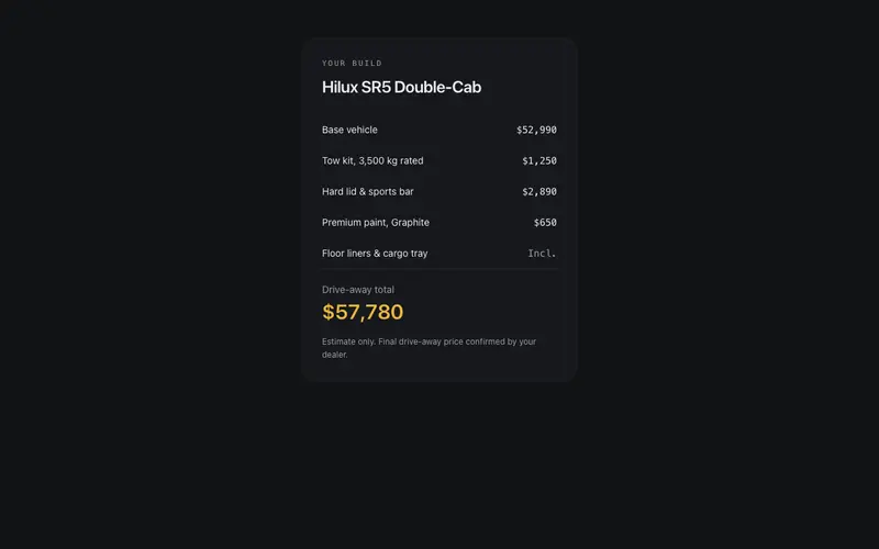
Build & Price Summary
A build-and-price recap panel with ledger discipline, base vehicle plus option rows in tabular figures and a drive-away total that counts to rest, deterministic and SSR-exact.
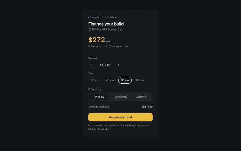
Finance Repayment Panel
A dealership finance estimator in React, deposit stepper, term radiogroup and frequency toggle drive a Tailwind-set repayment figure that counts to rest, with honest fine print.
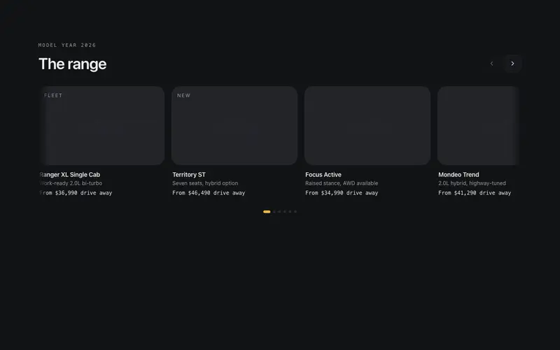
Model Lineup Rail
A scroll-snap model range rail for React dealer sites, per-body-style stroke silhouettes instead of photos, mono from-pricing, keyboard-scrollable region semantics, Tailwind tokens.
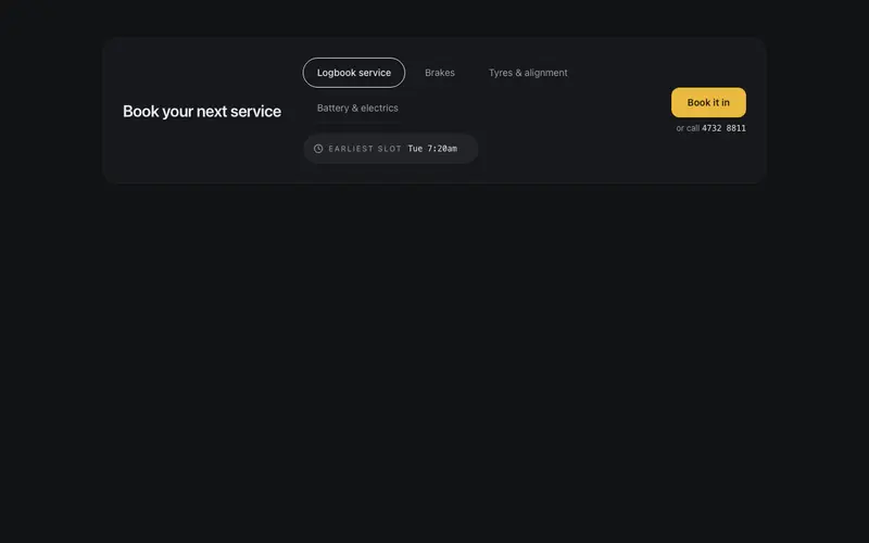
Service Booking Strip
A workshop booking bar that gets straight to work, logbook, brakes and tyres service pills, a preformatted earliest-slot chip in mono, a tap-to-call fallback, and one book-it-in action.
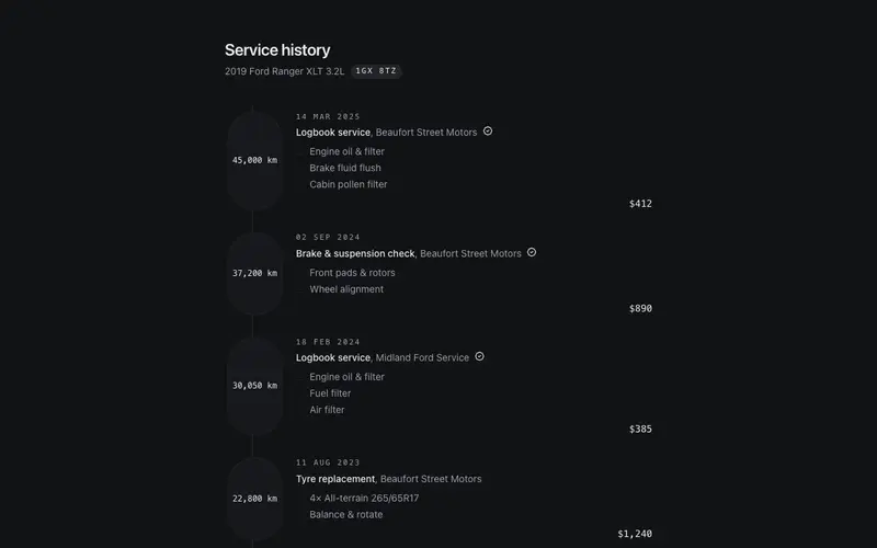
Service History Timeline
A React service logbook timeline for workshops and dealers, dated entries with mono odometer stamps, itemised work lines, honest totals, and a next-due marker in Tailwind tokens.
Frequently asked questions
How do I install the Spec Comparison Table component?
Register the @cleverui registry in your components.json ("@cleverui": "https://cleverops.com.au/r/{name}.json"), then run `npx shadcn@latest add @cleverui/spec-comparison-table`. The shadcn CLI copies the source into your project, you own the code from that point. You can also copy the source directly from this page.
What dependencies does Spec Comparison Table require?
Spec Comparison Table uses motion and lucide-react on top of React and Tailwind CSS. You don't need to install them manually, the shadcn CLI resolves and installs npm dependencies automatically when you add the component.
Can I theme Spec Comparison Table to match my brand?
Yes. The component is styled entirely with Tailwind utilities over standard design tokens (primary, background, muted, border), so it inherits your existing shadcn/ui theme automatically. Change your CSS variables and the component follows, no source edits needed for palette, radius, or fonts.
Want this built for you?
CleverUI is built by the Clever Ops web team. If you'd rather ship a hand-coded, fast, custom website than assemble one, we build them for Australian businesses every week.
Explore web development services