Studio Process Reveal
A studio process rail, oversized phase numerals reveal along a drawn hairline with a duration and deliverable per phase. An editorial React and Tailwind block where motion is the pitch.
Preview & code
Installation
pnpm dlx shadcn@latest add @cleverui/studio-process-revealRequires the @cleverui registry in your components.json, a one-off, two-line setup.
Usage
API reference
StudioProcessReveal accepts the following props.
…plus everything from React.HTMLAttributes<HTMLElement>: className, event handlers, aria attributes and the rest pass straight through.
Referenced types
Related components
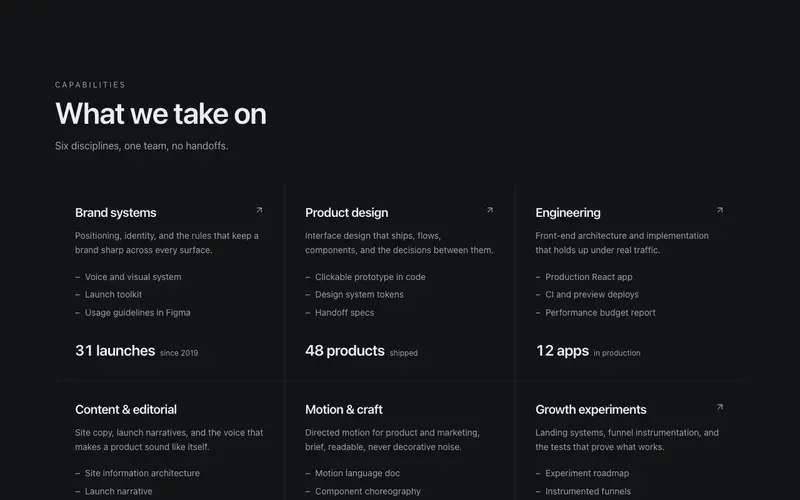
Capability Matrix
An agency capability matrix, a seamed hairline grid of disciplines with plain summaries, deliverable receipts and a preformatted proof stat each. A React block themed with Tailwind.
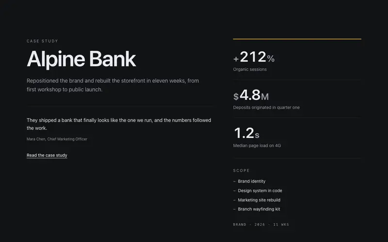
Case Study Spread
A one-engagement case study spread, the client name in display type beside counted result metrics, scope receipts and an attributed quote. React and Tailwind, work-first.
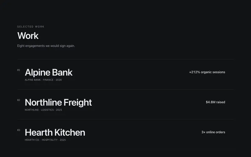
Selected Work Index
A selected-work index for agency and studio sites, oversized project titles on hairline rows, each carrying sector, year and a preformatted result metric. React and Tailwind.

Selling Process Timeline
The vendor's road to sold, appraisal to settlement as numbered ruled steps with week ranges in tabular figures and one auction-day milestone. A React and Tailwind block.
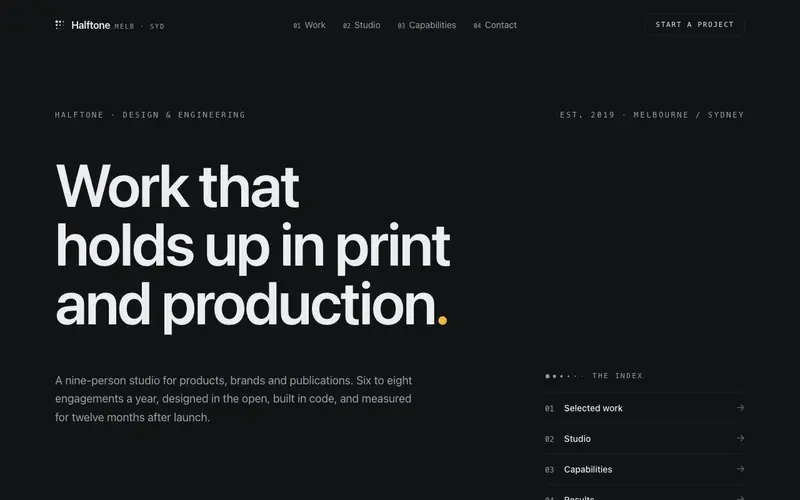
Agency Studio Template
A portfolio index for a design studio: display-type statement hero, oversized case rows with hover and tap preview plates, capability accordion, results strip, recognition ledger, brief form.
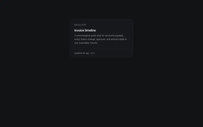
Drawer Card
Card whose bottom edge is a drawer, hover or focus slides a hidden action row up from behind a hairline, click-through safe and permanently open on touch.
Frequently asked questions
How do I install the Studio Process Reveal component?
Register the @cleverui registry in your components.json ("@cleverui": "https://cleverops.com.au/r/{name}.json"), then run `npx shadcn@latest add @cleverui/studio-process-reveal`. The shadcn CLI copies the source into your project, you own the code from that point. You can also copy the source directly from this page.
What dependencies does Studio Process Reveal require?
Studio Process Reveal uses motion on top of React and Tailwind CSS. You don't need to install it manually, the shadcn CLI resolves and installs npm dependencies automatically when you add the component.
Can I theme Studio Process Reveal to match my brand?
Yes. The component is styled entirely with Tailwind utilities over standard design tokens (primary, background, muted, border), so it inherits your existing shadcn/ui theme automatically. Change your CSS variables and the component follows, no source edits needed for palette, radius, or fonts.
Want this built for you?
CleverUI is built by the Clever Ops web team. If you'd rather ship a hand-coded, fast, custom website than assemble one, we build them for Australian businesses every week.
Explore web development services